
Colors are an excellent method for conveying meaning and information swiftly and efficiently. Color also has an emotional impact on us as each color carries with it its own inherent psychological undertones and implications. The ability to successfully harness color in an effective manner can make all the difference when it comes to expressing the message you wish to communicate.
The science of color psychology allows you to understand how colors make your audience think, feel, act and react. Wielding this knowledge, you may put these insights to work next time you prepare your slides, presentations or pitchbooks. Before we go further, we should examine what color psychology means. It is the study of how different colors or combinations of colors affect human thoughts, emotions and behaviors. This field is relevant to various professions from architecture and design to advertising and marketing.
The chart below illustrates some of the positive and negative connotations associated with nine of the most popular colors out there.
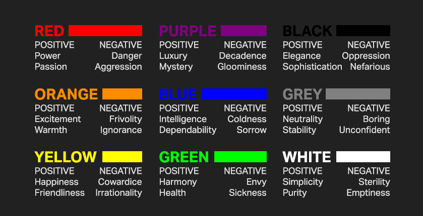
Colors have been known to alter moods, and have been demonstrated to alter alpha brain waves, resulting in the production of emotional responses. They elicit ideas, recollections and connections with events, locations and persons. As such, what colors mean plays an integral part in how an audience makes sense of data. How you mix, match and make use of the correct combination of colors will enable you to create powerful and striking visuals for your data. Therefore, it is worthwhile to consider how various colors can impact emotions.
Among the warm colors, red produces faster response reactions in the brain and causes the heart to beat at a faster rate while yellow, which is the color of most food in nature, instantly catches our eye and is often the color we recognize first. Meanwhile, of the cool colors, blue is the most relaxing and has been shown to have the opposite reaction of red, which is to lower our heart rate and blood pressure whereas green, which is the dominant color in nature, creates feelings of tranquility, peace and respite.
Nowadays, data visualization has become an essential part of the business world as it makes patterns more apparent, palatable and comprehendible. The importance of the role of color cannot be understated when it comes to how it can augment and enhance how you tell your story as it sets the tone for how people will react to your data. Let’s take a look at some key numbers from various studies and surveys:
- 85% of shoppers have said that color alone is the primary influencer of their purchasing decision.
- 90% of shoppers said that they have made impulse purchases solely due to the product’s color.
- A brand’s signature color has been demonstrated to enhance a brand’s recognizability by up to 80%.
- Shoppers make their purchasing decision in under 90 seconds upon their initial interaction with a product based purely on its color.
- People are 42% more likely to read the same advertisement if it is in color than if it were in black and white.
- Color increases understanding by 73%, readership by 40%, and learning by 23%.
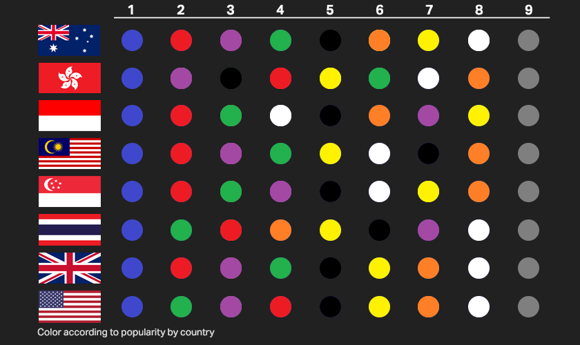
Knowing your target demographics, customers and audience — who they are; what they’re into and how they perceive colors is of utmost importance. Different colors mean different things in different cultures and countries. For example, white might symbolize purity in Western nations but in South Asian countries it is associated with mourning. Likewise, some colors are more suited to certain industries. Blue is widely used by technology and financial firms because it evokes a feeling of calmness and stability, which is what customers wish to feel when they are dealing with issues relating to new technologies and financial decisions. On the other hand, yellow and orange represent warmth and vitality; and are a popular choice for the healthcare and pharmaceutical industries.
When it comes to picking colors, it is important to note that different shades of a single color can suggest different meanings and emotions. For example, a light hue of blue may convey coldness and sorrow whereas a deep, rich blue conveys intelligence and dependability. Two or more colors can have profound effects on one another. They can be complimentary, such as black and gold giving an air of luxury and elegance or contrary in the case of green and red meaning go and stop.
There are two areas that data practitioners should pay attention two when it comes to colors and they are color composition and color harmony. Color composition comprises the three parts that form color as how we perceive it. They are hue, saturation and lightness.
Hue basically means color and is dependent on the wavelength of light being reflected or produced. Hues can be used to denote the various denominations or classifications in your dashboards.
Lightness measures the relative degree of black or white rather than the brightness of a color. The higher the lightness, the closer the color will appear to being white while the lower the lightness, the more it will appear to being black.
Color harmony, on the other hand, makes reference to the principle that certain color combinations create visually pleasing contrasts based on their geometric relationships to one another on the color wheel. In data visualization, the arrangement and combination of these colors can be used to amplify the impact of the story you are telling with your data has on your audience in myriad of ways.
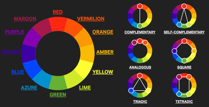
Complementary pairs are colors that are positioned on opposing ends of the color wheel. They can be primary, secondary or tertiary colors – creating rich, high contrast color palettes. In contrast, split complementary blends are composed of one key color and two other colors that are next to the complement of that key color. When three hues that are adjacent to one another on the color wheel are used, this combination is known as an analogous color scheme. These combinations are known to be pleasing to the eye due to their visually appealing balance.
Offering powerful contrasts, triadic color combinations consist of three colors that are positioned at equal differences from one another on the color wheel. A square color combination is made up of four colors that are in an equal distance from one another on the color wheel whereas a tetradic color combination is made up of two pairs of complementary color schemes.
In addition to color harmonies and compositions, there are also three kinds of color palettes widely employed in data visualization that make them simpler to digest. These are qualitative, sequential and diverging.
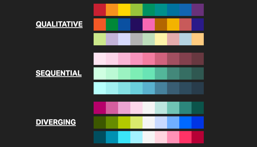
Qualitative palettes have diverse colors that are clearly distinct from one another and are optimal for visualizations showcasing categorical variables, especially ones that are not related to each other.
Sequential palettes utilize a variety of saturations and gradients of just one hue of color and are used to convey data that are in serial, enumerated values.
A diverging palette is used where a band of variables is involved, using one color to showcase data on one end of the band, a different color on the other end and a neutral color to denote the center. The colors between the central neutral zone and the ones at both ends of each spectrum are gradients between the neutral and end colors on both sides.
Using colors that are unrelated to one another can make it difficult for your audience to understand and digest the data you are presenting to them. Likewise, be mindful that not everyone in your audience can see the full-color spectrum. Therefore, you’ll want to maximize accessibility and present your findings in the most accessible way possible so that no one gets left out.
The importance of selecting the appropriate colors for your data visualizations cannot be overstated as the goal of data visualization is to communicate the story behind the data. By carefully considering your choice of colors, it will do wonders in emphasizing the key arguments of your tale and ensuring that your intended message gets delivered to your audience.